Customer Communications
Comcast asked us to create a repository for their past projects and present them in an easy to navigate, shareable and highly visual way.
Wrangling Content
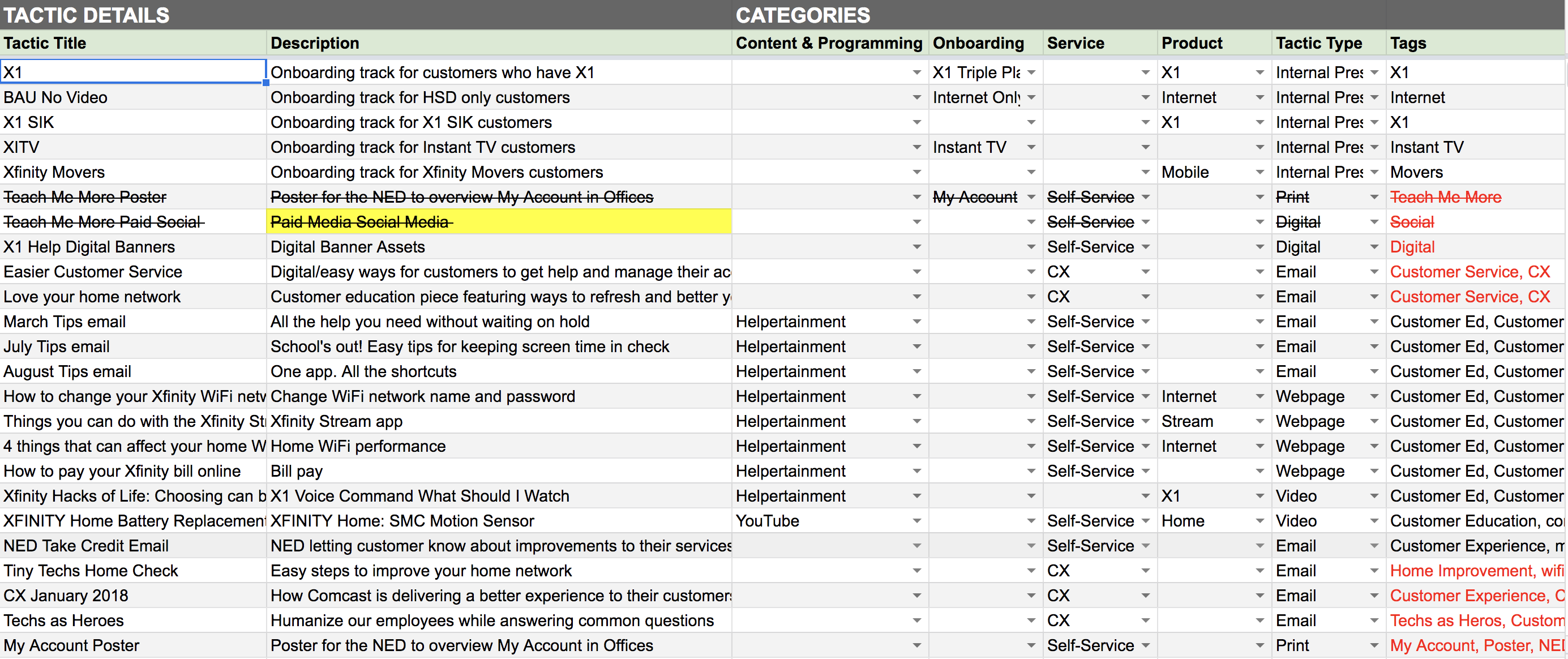
Our first challenge was to organize the overwhelming amount of content from each team, each of which had different requirements. The easiest way to get wrap our heads around where to begin was to create a spreadsheet and have point people from each team fill in the content themselves. Agency M's stellar content strategists consolidated the content into a more manageable form.
Wireframe to Prototype
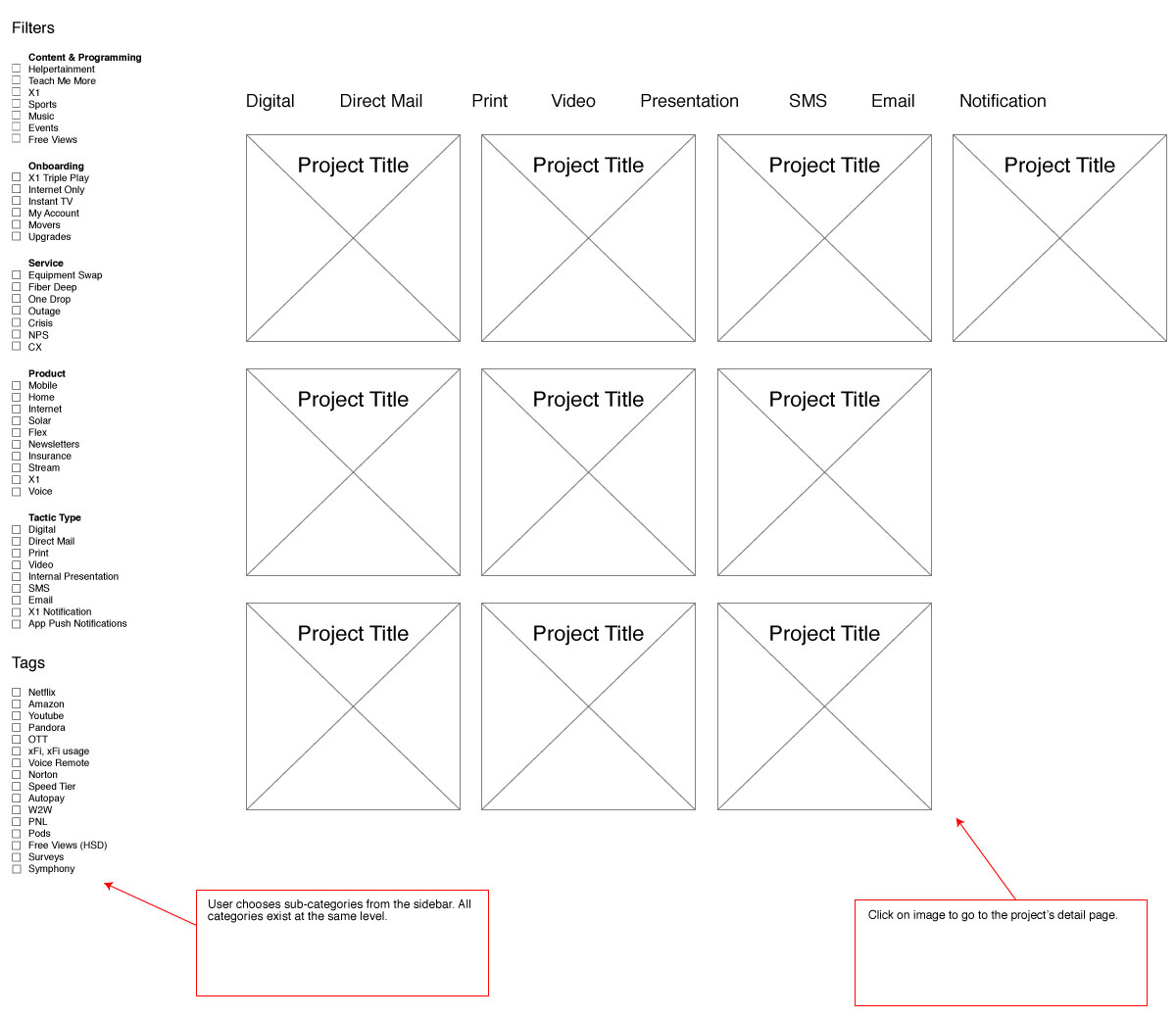
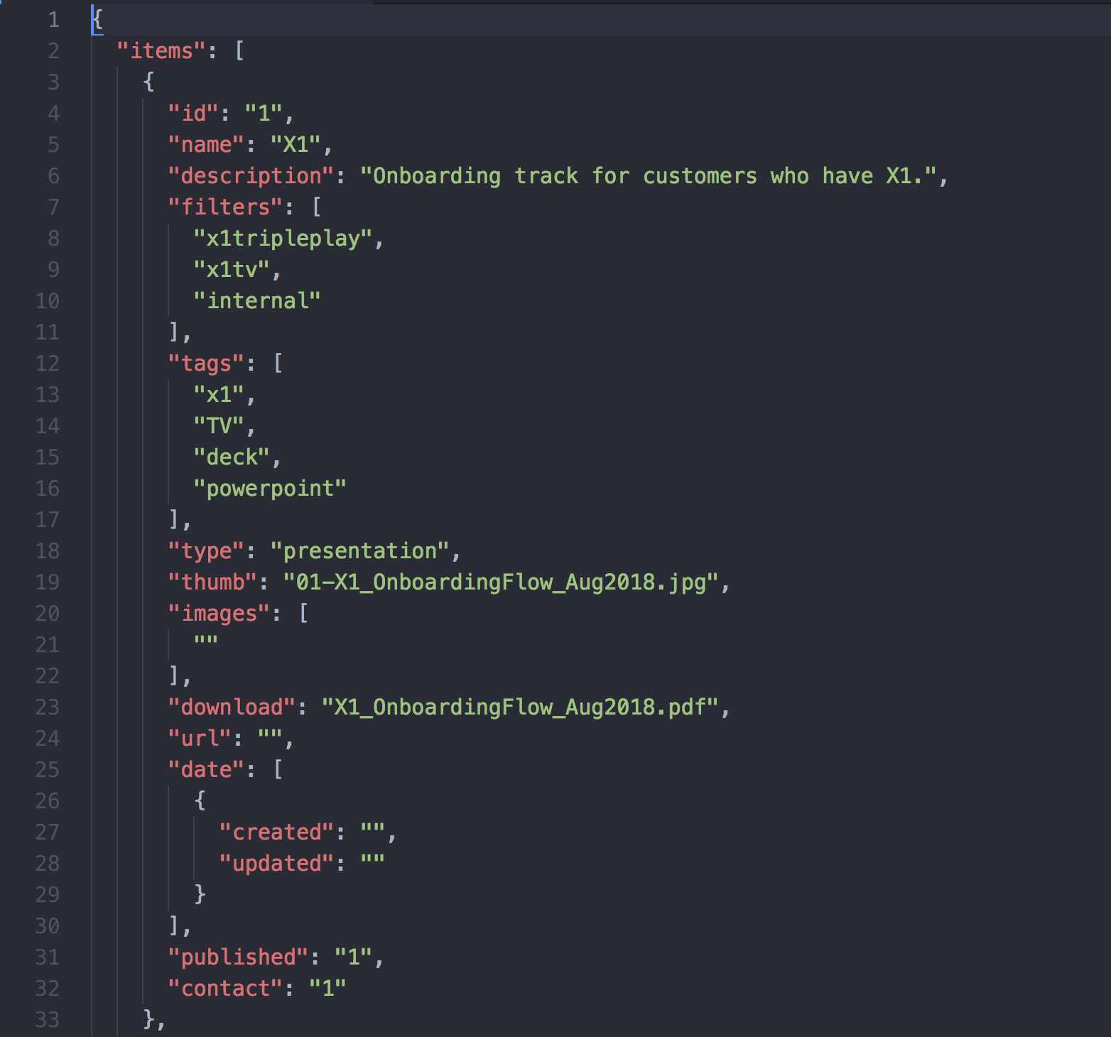
The next step was to take the content and translate it to something visual. I created a quick wireframe to show my thinking. However on further discussion, it was decided it would be faster to code a functional prototype. In the interest of portability and security (no databases), I used JSON to store the data and PHP, JS, CSS and HTML to present it.
Prototype to Launch
Since the prototype was functional enough to test on, I was able to perform some basic UX tests around the office in order to progress with certain design decissions. For example an early concept used drop-down menus for filter selection, but after testing, I found they were clunky and hid too much information. The user needed to see what options were available and how many options were left. They also needed a variety of ways to find the content. A search function and invisible tag system was created to aid with terms that may be unfamiliar to certain users (Comcast loves their acronyms).
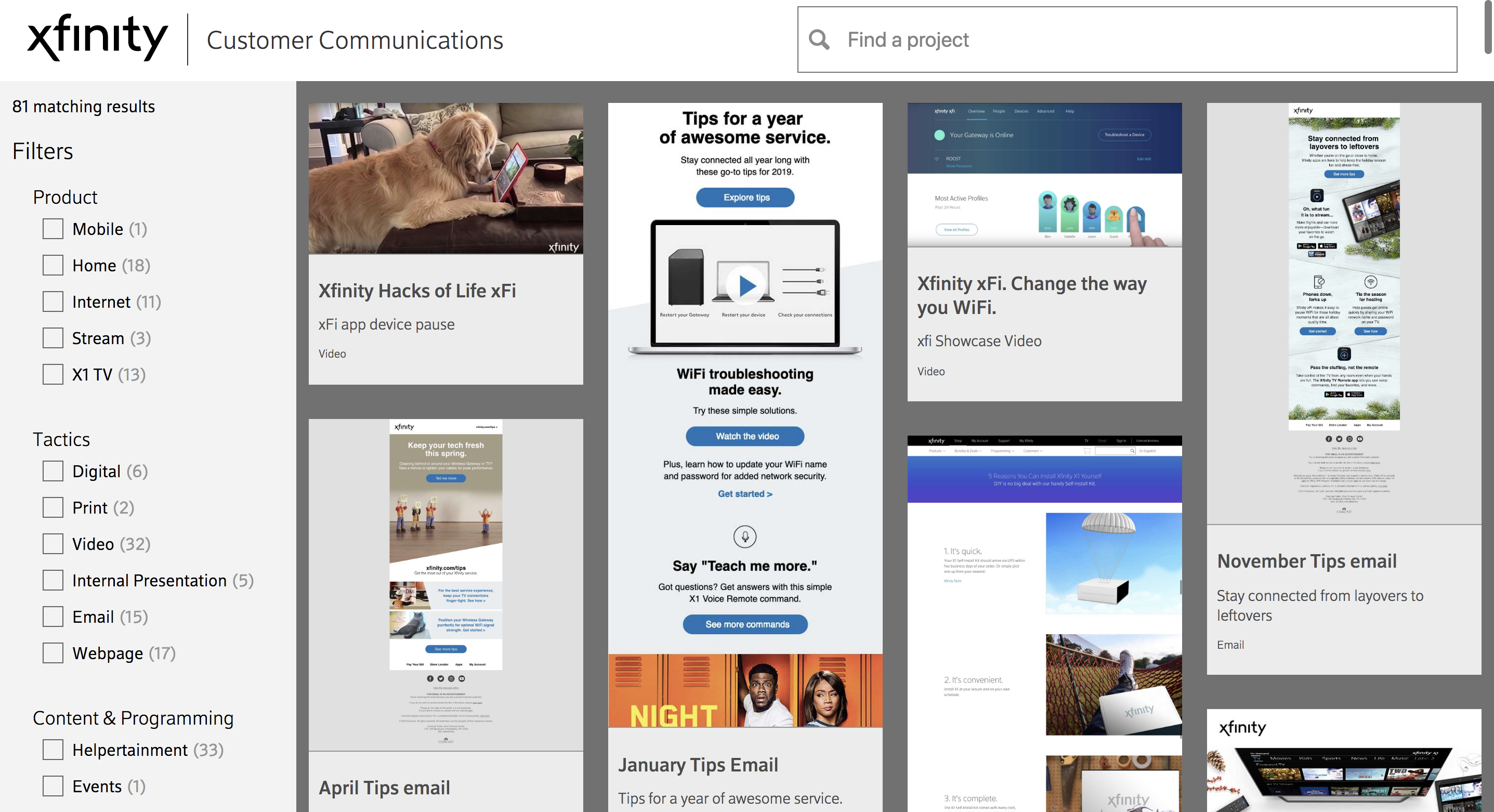 The presentation of content.
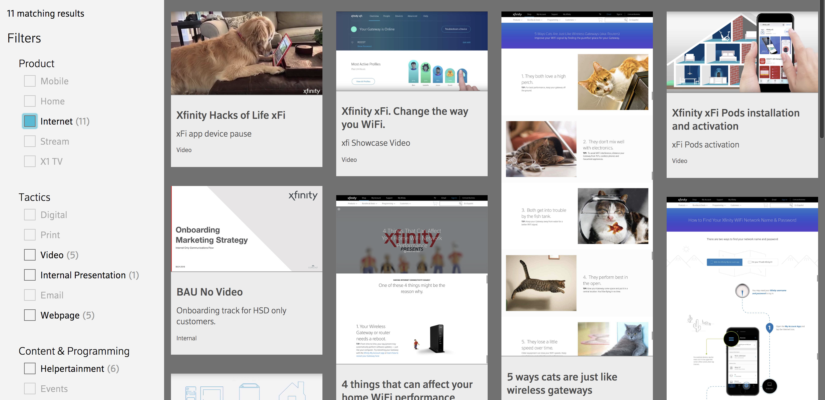 The content being filtered. As each filter is applied, the site recalculates what is left and deactivates the content that does not apply, quickly narrowing down your options.
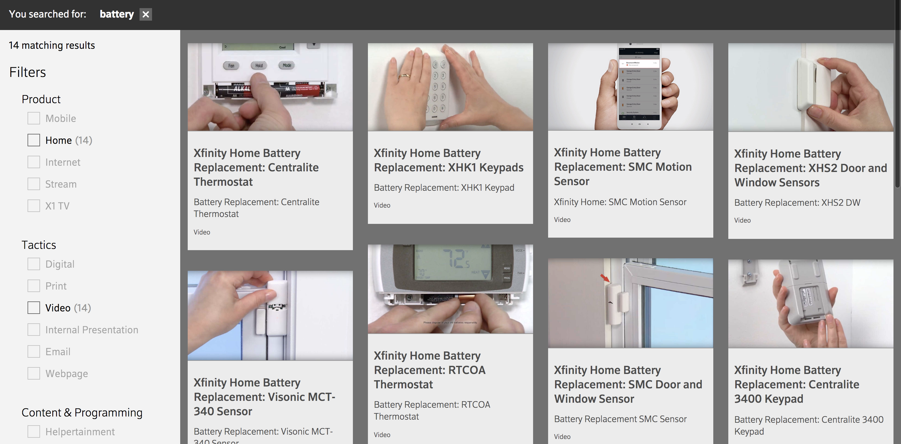 The search function showing all content that has to do with the term "battery". The results are available for further drill-down.
The end result is a content-heavy, lightweight code site that moves fast despite the amount of filtering needed to serve up the right content.